Album Cover

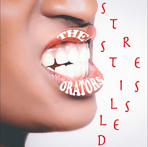
To start, the album name and band name were randomly selected through the title of a Wikipedia page and the last few words of a list of quotes. The band name given by the Wikipedia page was 'The Orators' and the album name given by the quotes page was 'Still Stressed'.


My album image was taken from pexels.com, these photos are free to use therefore avoiding the copyright breach.
I wanted my image to relate to either the album name, the band name or both. to do this I searched the word 'mouth', this is because the word orator is linked to speech. I selected the image shown as it shows stress which matches the album name perfectly.


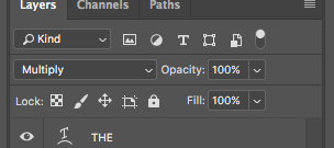
I then went into Photoshop, inserted the image and resized it to fit into the 800x800 pixels canvas. While resizing the image, I held down the shift and t key to ensure that the image didn't warp. I then began to enter my text on separate layers. Using different layers meant it was easier to delete any mistakes and move individual elements.


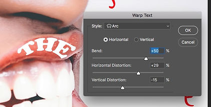
For the first layer, I selected the horizontal type tool, entered 'the' and warped it to fit along the top lip as closely as possible. I did the same for 'orators' but on a new layer and along the bottom lip. I then set the font to Cooper Black and colour to white which created a link to the background while still being bold.


I gave each letter of the album a separate layer, this was so I could organise the letter in a way that was rough to show stress but still be easy to read. In the end, I decided to place the letters next to the mouth like the title was being spoken through gritted teeth. Also, the overall placing was neater.
The letters were originally placed vertically but that was more about filling the space than effectively communicating the album's name. I coloured the album name red to create a contrast. As the band's name was white on a read background, I thought it would make sense for the album name to be the opposite.
I chose this particular font for the album name as the writing looks rushed and untidy which could also be argued to show stress.
After that, I made a new layer and placed a square over the whole thing using the rectangle tool then gave it a red to transparent gradient overlay. After this, I put the layer underneath the layers for the main images and text and changed the opacity of both these layers so that the red from the gradient could show through.
Lastly, I gave the text outlines of different thicknesses. This was done by duplicating the layer for some of the letters, rasterizing those letters then going to edit -> stroke where I could choose how thick the red, white or black stroke was going to be.


I thought about taking some inspiration from the Disclosure album 'Settle' and used the curved tool on Word (insert -> shape -> curve) to test out outlining parts of the face to make it stand out more. However, while the white lines didn't look too bad, I decided that the album was better as it was and the lines on the mouth would look too random and messy even if they used the same colours as the rest of the cover.
