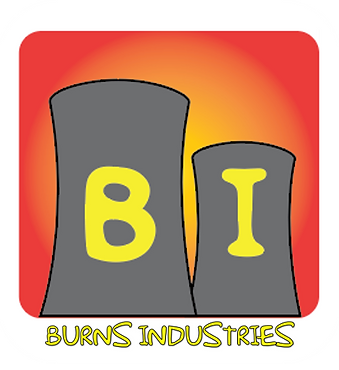
Logo


<--Inspiration
For my logo, I have decided to design fir the fictional business 'Burns Industries' from the popular cartoon series The Simpsons. Mr Burns owns multiple venues in Springfield such as the Isotopes stadium, the casino, the opera house and the prison. However, this logo will focus on his main business venture - the nuclear power plant. I started by searching google images for some inspiration then I took specific elements from the images to form my four initial ideas.
Elements Taken:
- Simpsons Font/Colour
- Plutonium Rod
- Cooling Towers
- Nuclear Symbol
- Outline of Burns' Head


<--- Initial Ideas
<--- Idea Development
Both development followed the same process.
For idea one, I tried it with the full business name but it felt too big and clunky.I did the same for idea four but that felt more messy rather than clunky and not clear enough.
To solve this, I decided to make the main images the main focus and the text smaller but still legible. This was to make the logo neater and because pictures are easier to remember than text. If people were to see these images they'd be more likely to recognise the business.
In the end, I decided that it would be idea one that I drew out on Illustrator.


<--- Illustrator Drawing
I started by inserting a picture of the cooling towers to get an idea of how my logo was going to be arranged.
I then drew a rounded rectangle over one of the towers and warped the side to fit.
After that I used the swatch palette to make the grey with a black outline and duplicated, scaled and placed the second tower behind its original.
After expanding the shape, I used the direct selection tool to flatten the bottom of the rectangle and curve the top more so it looked smoother and more like the cooling towers.
I then moved onto the text. Using the text tool, I entered a capital B then changed the font and type size to the Simpsons font at 60pt. I duplicated the B, changed it to an I and centred both letters in their espective towers. Then I grouped all of the elements together.
To complete the logo, I added a rounded rectangle with a yellow to red gradient for the logo's background and place the company's name underneath in a smaller size but using the same Simpsons font. I chose the yellow to red gradient as they are considered to be colours that represent danger which matches the company as they deal with radioactive/nuclear products which are, clearly, dangerous.


final logo shown in .png format against a white background as the black outline of "Burns Industries" wouldn't be visible on the page.
