Poster


<--Inspiration
For my poster, I chose to create onr for the 2011 movie, Attack The Block. I started by looking on google images and pinterest for some inspiration then I took specific elements from the images to form my initial ideas. The research led me to decide that I wanted to make sure that my poster at least consisted of the main characters and clearly put across the alien/sci-fi theme.
The posters that I found were mainly illustrated and the majority of them had a blue theme that was the same shade of blue as the aliens' teeth in the film. My poster will still have a blue theme but a darker blue to match the hue of the scenes in the block's corridors.
![20181203_231704[1].jpg](https://static.wixstatic.com/media/fffbb3_e399eb56d25f47ada45f0a7f8de1f67b~mv2_d_2240_4608_s_2.jpg/v1/crop/x_0,y_685,w_2240,h_3039/fill/w_253,h_342,al_c,q_80,usm_0.66_1.00_0.01,enc_avif,quality_auto/20181203_231704%5B1%5D.jpg)
![20181203_231641[1].jpg](https://static.wixstatic.com/media/fffbb3_bd52af7f8f3944e180967d6f22a0ef5a~mv2_d_2240_4608_s_2.jpg/v1/crop/x_0,y_1078,w_2240,h_2896/fill/w_256,h_331,al_c,q_80,usm_0.66_1.00_0.01,enc_avif,quality_auto/20181203_231641%5B1%5D.jpg)
![20181203_231616[1].jpg](https://static.wixstatic.com/media/fffbb3_7bf804f63844478a92c43eb1915d0e58~mv2_d_4608_2240_s_2.jpg/v1/crop/x_863,y_141,w_3022,h_2089/fill/w_327,h_229,al_c,q_80,usm_0.66_1.00_0.01,enc_avif,quality_auto/20181203_231616%5B1%5D.jpg)
![20181203_231537[1].jpg](https://static.wixstatic.com/media/fffbb3_578e21ed657f4bfcb93fdf5e11c34bf7~mv2_d_2240_4608_s_2.jpg/v1/crop/x_0,y_968,w_2240,h_3036/fill/w_271,h_367,al_c,q_80,usm_0.66_1.00_0.01,enc_avif,quality_auto/20181203_231537%5B1%5D.jpg)
<--Initial Designs
I had two initial designs, the first one being portrait and the second being landscape.
The first one was more me putting my ideas onto the page, the arrangements weren't though about clearly and so the elements looked as if they'd been placed on randomly to fill the page. However, a positive about it is that the characters on the left fitting into the mouth of the alien shows how intimidated/powerless these people are at the start of the invasion. In this poster, I thought I would illustrate the characters using an item that makes it obivous that it's them; Moses' and Pest's hats, Biggz's hair, Jerome's glasses and Dennis' helmet/motorbike/scarf. In the end I decided that this would only work for people who had seen the film. The second poster idea shows how I changed that.
For the second poster idea, I developed the first idea. I gave the poster structure by including the block that gets attacked in two point perspective. All of the text would be placed around the windows and the characters' actual faces and aliens would be in different windows.




Inner
Windows

Main
Building

Outer
Windows


<--Illustrator/Photoshop
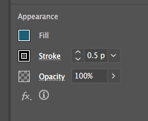
I started the poster on Illustrator. I put in a perspective grid by going to view -> perspective grid -> show grid. After that, I placed a rectangle on the left plane by pressing the number 1 key and dragging it out from the top right corner of the plane. I then drew a rectangle on the right plane by pressing the number 3 key and dragging from the top left. These rectangles formed the main building. For the windows I drew four rows smaller 2x3 rectangles on the left side then reflected it, for accuracy, and put in on the right side.
Moving onto the colours, I gave the main building a dark blue colour and the outer sections of the windows a dark teal colour and the main window a pale light blue colour. The use of the dark teal gave the building a more 3d feel.
To make the building more detailed, I added a brick texture by drawing two rows of smaller rectangles in a brick formation then copying and pasting these two rows for accuracy. Then, after grouping the rows, I duplicated and reflected the bricks for the right plane.
I then entered the strap line, 'inner city vs outer space', just above the top row of windows. I set the font to OCR A Std and the size to 40pt. I chose that font because it gives the feeling of the space invaders game which goes with the film itself as the aliens come crashing down (invade) at the start. I put the title into perspective using the perspective selection tool but kept the cast list and quote flat on the page. All the text was done in this way but in different sizes and fonts. The film tile was in the same font as the strap line at size 12pt, the cast list was in font arial narrow regular, size 16pt and the quote was in the font impact at 20pt. The title and strapline look bigger due to the perspective warps.
After copying the vector to Photoshop as a smart object, I went into Photoshop and created the backdrop for the poster. I went onto pexels.com and searched for images of stars to represent space. I saved the image shown, put it in the place of the blue background then went to adjustments -> posterize at 5% to match the illustrated part of the poster. The star backdrop was also given a blue gradient to add depth to the poster.

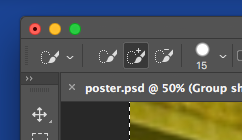


Originally, I was going to put the main characters faces in the windows of the block but it became clear that they were being lost in the background which wasn't ideal. To resolve this, I made a silhouette of the characters and put that in the foreground instead. This was achieve by me finding a group shot of the characters on google images then inserting the shot into Photoshop and placing it along the bottom of the poster.
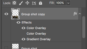
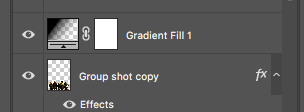
After duplicating the layer, I selected the quick selection tool and marked out, as closely as possible, the parts of the shot that I wanted to keep then I pressed enter to remove the unmarked areas. I then added a blue colour overlay and a black to transparent linear gradient overlay and placed this directly on top of the original group shot layer. I then hid the original group shot layer and attached a transparent to black gradient layer to the group shot. The gradient layer allowed the elements of the poster to look less like a collage and more naturally positioned.
Although the characters' faces aren't shown so clearly, it's clear that they are the main characters as they look like they're defending it.
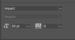

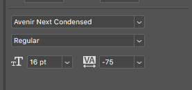
For the cast text and quote text, I used the text tool. I gave the cast list the Avenir Next Condensed font so the text could look like the actual font used on movie posters which adds to its authenticity and put the quote boldly so that it was clear that the film had been received positively.


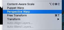


Finally, to make the aliens, I went onto Word and grouped together three explosion shapes. I then made four more copies (pasted as pictures) of this so that there were the same amount of aliens shown as there are characters and I cropped these copies at different point to make it look like the aliens were being shown from different angles. Then I copied and pasted these into Photoshop, rasterized them and using the perspective tool, fit them into their respective windows.

